Video marketing works. That’s a fact.
Surveys show that people watch an average of 17 hours of online video per week, and video content accounts for around 85% of all consumer internet traffic.
This isn’t surprising. For starters, video content is more compelling than web copy and static pictures. It draws you in and engages you in a way no other medium can. So making video landing pages for your products and services is a no-brainer. It’s a great way to increase engagement, generate leads and boost conversions.
However, there’s a ton of video content out there already. How do you cut through the noise and make an impact with your audience?
Incorporating video content into your landing page is effective, but there are tips and tricks you should keep in mind to keep customers engaged so they don’t click away.
This how-to guide has everything you need to know about how to make a video landing page that converts, including examples, step-by-step instructions, and a list of all the factors you need to consider.
Ready to create your best landing page yet? Let’s start.
What Is a Video Landing Page?
A video landing page is exactly what it sounds like: a landing page with video content that links to a specific product, offer or campaign. They are also often referred to as:
- Video squeeze pages
- Video sales pages
- Lead capture pages
- Post-click pages
- Destination pages
Whatever terminology you use, there is no standard video landing page template. Sometimes, the topic and purpose may warrant your video being the focal point of the page when it first opens. On other occasions, a smaller video below the fold accompanied by text and other media may be a better tactic.
The style of the video may also vary depending on the goal. For example, the video you’d use for a product promotion would differ from the one you’d use to push a webinar or newsletter sign-up.
More on that later, but for now, here’s a list of the most common video types:
- Product promotion video
- Demonstration (demo) video
- Explainer or “how-to” video
- Testimonial video
The Benefits of a Video Landing Page
Before we delve into best practices, let’s talk about the benefits of using video in your landing page.
Videos are a powerful tool in getting a visitor’s attention — and turning their interest into action.
The best video landing pages use videos to educate, entertain and convert in one smooth process. Educate your audience about your product with an easy-to-follow video so they can feel more confident in their purchase. Film real-life customers singing praises of your company, creating a compelling customer testimonial that helps viewers gain confidence in your product or service.
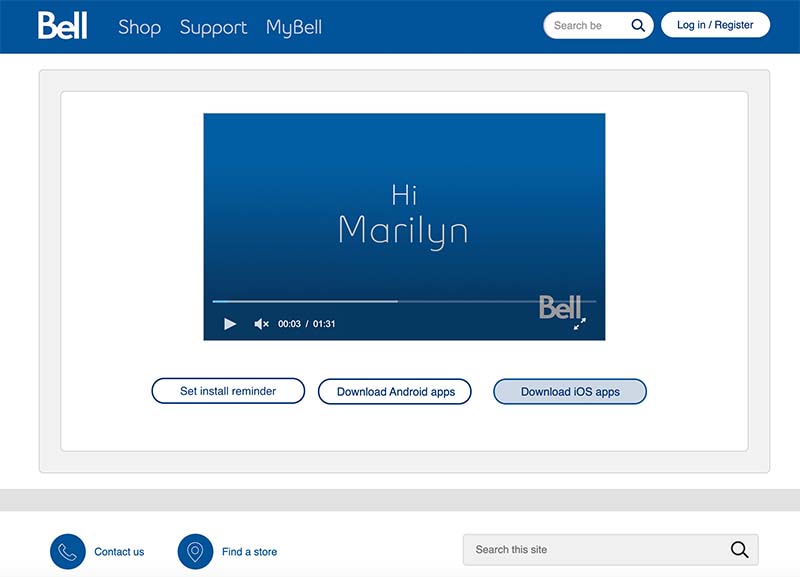
Conversions are usually the primary goal, so we’ll focus on that quite a bit in this guide — although you might have multiple ways for customers to convert as you can see in the example from Bell above.
Here are the advantages to using a video landing page.
More Conversions
Plain and simple, videos help your landing page deliver better business results. They drive conversions, as much as 11x higher conversions when the video is personalized. But video in general gives a boost to sales and leads.
- Almost 90% of consumers say a brand’s video has convinced them to make a purchase.
- 90% of marketers have seen video help them generate leads.
Video content creates leads and conversions by grabbing attention and connecting with site visitors on an emotional level. Performance varies, but many marketers report conversion increases between 80% and 300% when switching from a standard landing page to a landing page with video.
These video metrics are especially impressive when you consider the digital noise that exists today. Consumers have increasingly tuned out what doesn’t immediately interest them. What’s more, any landing page you create is competing with hundreds of thousands of others. Video marketing is key to help your landing page rise above this.
Why? Because, with video, the audience can understand your product or service at a glance, rather than having to scroll through lots of text. Any questions they may have can be answered preemptively, which instills early confidence and increases the likelihood of a purchase.
Clearer Information
There’s nothing more off-putting than a page with too much text. You’re skimming this blog post right now, aren’t you?
Walls of text are overwhelming, and if it takes too much effort to find the information they need, digital consumers will simply click away and spend their money elsewhere. Videos are a great way to avoid this as they can present information clearly, in an interesting way, and in a shorter amount of time. One analyst from Forrester Research estimates a single minute of video is worth about 1.8 million words.
Increased Engagement
The audio and visual elements of video combine to engage customers and keep them on your site longer. Not only does this increase your chances of converting visitors from a lead to a sale, but it can help your SEO performance too. Search engines like web pages that web visitors like. As more people engage with your video squeeze page or explainer page, your page can move up in search results.
Leads from video landing pages are likely to be higher quality because viewers have a more thorough understanding of your products after watching a video than they would after skimming several paragraphs of text. Plus, the chances are higher that site visitors will stay on your landing page to learn more after watching a video.
Better Branding
Videos help promote your offerings in a creative and interesting way while showcasing your brand personality and building trust as an industry leader. It’s more than just integrating your company’s logo and brand colors, though that’s important. It lets you include your brand voice and tone.
This creates powerful brand associations with your viewer that can stick with them long-term. Remember: Video is much easier to remember than text, so when you use a video landing page, you’re helping your brand be more memorable long-term.
Evergreen Content
The big hangup most marketers have with video? It’s hard to update (usually). You do a big splashy campaign, top-notch visuals, a great voiceover, the works. And then in 6 months — often less — it’s outdated. And you have to dig into the company coffers again to update it.
Fortunately, video technology has evolved. You can now have one video, put it on a web page, and watch as that video updates in real time based on new data. That data can be based on who’s watching it, such as the viewer’s location or device, or other first- or third-party data, such as retail inventory or flight times. That means site visitors always get the most relevant information.
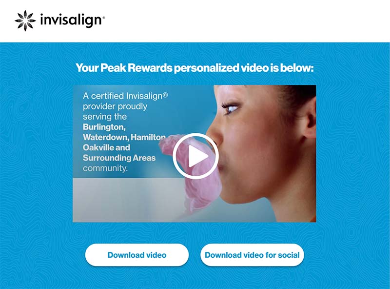
Example: Display current promotions, items in stock or available coverage for the viewer’s location as shown in the Personalized Video landing page above. With Living Video, it updates automatically on your landing page based on the parameters you set in advance.
Types of Video Landing Pages
There’s no definitive answer to which is the right video landing page template to use. Certain styles will be more effective depending on your goals. This list covers the most common options and when to use them.
Hero Video
Hero videos are placed front and center above the fold in place of a header image. This design is popular for explainer and promotional videos where the aim is to get viewers interested as soon as they open the page.
Supporting Video
Supporting videos are placed below the fold to support other pieces of content in the main body of the page. This layout is often used for testimonials as videos can be strategically placed to add social proof at the exact point where visitors may need additional convincing.
Background Video
Background videos, as the name suggests, take up the entire background of the page and are used to draw attention to a headline, button or key piece of text.
Background videos are an excellent way to grab attention, particularly when promoting products that involve movement, as it gives the viewer the feeling of living the moment with you.
Pop-up Video
Also known as lightboxes, pop-up options allow for the video to display later without overloading the viewer right away. They’re typically accessible when the user clicks a thumbnail, button or other link, but you can also add pop-up videos based on the user’s actions. Maybe they scroll to a certain part of your site and you trigger a pop-up with a video that would interest them. Pop-ups are popular for demonstration videos and explainers.
Video Splash Page
Not to be confused with pop-up videos, a video splash page is technically not a landing page video at all. It’s an introductory pop-up that site visitors must click off to enter the main site. These are typically used to make a big splash (hence the name) with a timely promotion or a mood-setting scene for a highly visual brand.
Video Landing Page Examples
Here are a few of the best examples of landing pages with video and a rundown of what makes them effective.
CCP Games
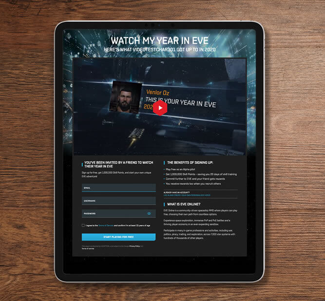
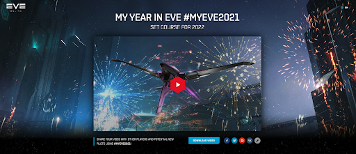
In the innovative “My Year in EVE” campaign from CCP Games, players could show off their achievements in a unique Personalized Video. These are the features that made it unique:
- Each video was generated in real time based on the stats individual players chose to include.
- Videos fit a global audience. They could be generated in English, French, German, Russian, Japanese or Korean.
- If players shared their personalized landing page and a friend used the featured sign-up option, they both received extra points.
The result? A 66% increase in web traffic to the EVE Online recruitment page.
Plan International
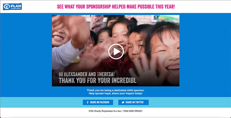
Video landing pages can be a great addition to an email campaign as you can see in this example from Plan International Canada. To thank donors for their ongoing support for communities in need during the pandemic, the nonprofit created a personalized year-in-review video and hosted it on this landing page, shared via email.
The campaign showed how funds are used to help people on a local and global scale. Much more than a generic video, this Personalized Video created an emotional connection with each viewer by showing them the children they sponsor — their names, photos, ages and more.
Idomoo
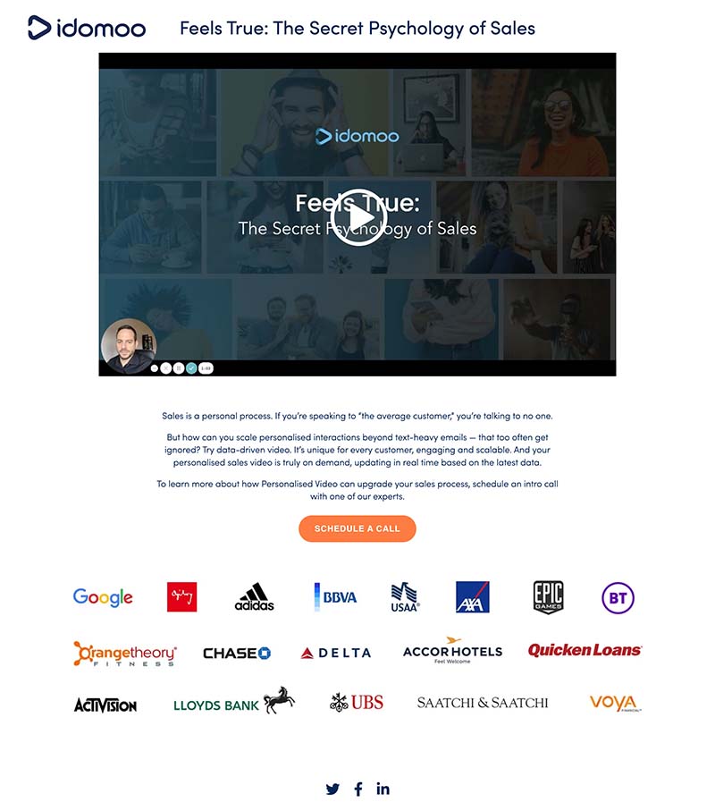
One kind of video we haven’t discussed yet is webinars. They’re not the standard marketing video example, but if you send a webinar to someone (or they click to access a webinar), there’s just one action you want them to take right away — watch the webinar!
To do this, our webinar landing pages have the video front and center. Farther down, there’s a little bit of text and a clear CTA for those ready to take the next step. Short and sweet.
How To Transform Your Website With a Video Landing Page
Whatever marketing strategies you invest in, you want to make sure you’re getting a good ROI. Building a video landing page isn’t necessarily the cheapest option, but there is potential for higher returns once that page starts converting. And it can also be paired with other digital strategies like Google Ads or social media marketing to get paid traffic to your video landing page.
Follow this step-by-step guide to learn how to build the best video page for your website.
1) Determine Goals and CTA
You need a firm understanding of the page’s purpose and what you’re hoping to achieve before you can choose a suitable video landing page template.
Physical products, services and registrations for events or newsletters all require different tactics to convince website visitors to take action. By setting goals in advance, you can concentrate on creating a page that is:
- Relevant to viewers
- Valuable to viewers
- Communicated clearly
- Specific rather than generic (Otherwise, what’s the point of the landing page at all?)
Post on
You’ll also need to consider your call to action. After all, there’s little point in making an amazing video if the people who watch it don’t know what action to take after watching it.
Once you have specified your goals, coming up with the right CTA should be relatively straightforward. Strong words that give clear direction are usually the best options for a video landing page. Examples by type below. (Notice that they all start with a verb.)
- Retail and e-commerce: Shop, Buy Now, Order, Reserve
- SaaS, Apps and General Tech: Try It, Download, Book a Demo, See How
- Services: Get Started, Learn More, Consult, Contact Our Team
- Nonprofits: Donate, Join Us, Volunteer, Give
- Newsletters: Sign up, Subscribe, Read More
- Freebies: Grab, Claim, Get Yours
You can choose to have your CTA visible throughout the entire video, only at the end, or popping up at strategic points throughout.
Remember that a consumer shouldn’t have to guess what the next step you want them to take is. Once they’re confused, it’s likely they’ll click off — and you’ll lose a potential lead. With this in mind, if you notice your landing page’s conversion rate is lower than you hoped, make sure your CTA or desired link is front and center.
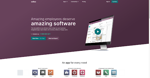
You can make sure your visitors notice your CTA by designing your landing page with minimalism in mind, as Odoo does with this landing page. Their color scheme is simple, but still looks great. Plus, it doesn’t take away from what’s most important: the video. They even use the CTA as a fun pop of color — that matches with the play symbol — helping it stand out from the rest of the page.
It’s even better if your CTA is interactive. Make your video clickable to drive engagement and conversions. Once your viewer is done watching, an interactive video allows them to instantly take the next step — making it easy for your customers to convert.
2) Develop Content
Your content should be developed to match your goals and CTA. Once you decide which type of landing page you need and where your video will live on it, you can plan other content around it.
Your video should have a clear storyline, and you’ll need to plan the script, including whether it’s spoken or appearing on screen.
If you’re filming, it’s usually a good idea to do a few takes and get extra footage so you have options later. You may want to do an A/B test down the road. Think of the possible variations you might need and plan accordingly.
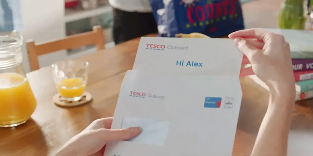
If all of this sounds a little complex, don’t worry. The easiest way to impress your audience has nothing to do with special effects like wind and fire (although we have a really cool example with that). You can personalize your video to instantly add wow factor. This means as you develop content, you’ll want to think of who might be watching — a new customer or a loyalty club member, someone who purchased Product A or Product B?
You can also make the video contextual to prevent it from becoming outdated. With Living Videos, your video content automatically updates according to the world around them.
Greet your viewer with “good morning” or “good night”, depending on the time of day. Show them a video recommending your best-selling sweater if they live somewhere cold — or a swimsuit if they’re in a more sunny area.
You can also leverage live data to make sure your video is always relevant. A video that incorporates real-time data can:
- Display a product’s current price
- Show the latest flight prices
- Recommend a promotional deal based on the time of day
- Educate patients on the current mold and allergen count
We can take care of all of the complexities for you, from scene logic to videography, or you can launch the campaign in a matter of days on your own with our self-serve platform.
3) Write Copy for Your Landing Page
As we touched on before, minimalism is key. Your video should be able to replace lengthy text, preventing you from overwhelming or boring your visitors.
The copy you do include should give the visitor an idea of what your video is about. Try to create a simple, yet interesting, headline to grab their attention. Aim for small chunks or bulleted lists your audience can skim or read in a matter of seconds.
Take a look at this landing page CCP Games created to host their personalized highlight reel campaign for EVE Online. The headline is loud and clear. It even includes a hashtag to encourage viewers to share their video with friends.
Another way you can live up your copy — without making it complicated — is by including your customer’s name in the thumbnail of your video, bound to attract more attention than a generic one.
4) Optimize Your Video Landing Page for SEO
To get the best rankings in search, you’ll need to optimize your landing page video using similar on-page SEO principles to those you’d use for regular web pages. Here are several ways to ensure your video is properly optimized for SEO:
- Include and frontload important keywords in the title.
- Ensure your metadata is the optimum length and includes relevant keywords.
- Write a video description that is clear, compelling, and encourages viewers to watch it. Be sure to frontload the key information, as only the first 100 characters will appear in video search results.
- Embed the video on your website so viewers can watch it on the landing page itself rather than being redirected to another site like YouTube. This will keep customers on your page and eliminate pop-up ads that could act as a distraction or reason to click away.
- Include a video transcript. Not only does this increase your web accessibility score, but it makes your video more SEO-friendly because the transcript counts as additional text on the page.
- Make sure your thumbnails and video are optimized for web and not slowing down page speed, a key ranking factor.
Update your XML sitemap to make it easier for search engines to find and index your video.
5) Deploy Your Video
We wrote a whole guide to video distribution, so we won’t go too in-depth on this one, but suffice it to say, you need to make sure your video landing page gets to the right people.
You can share it via an app, social media, email, MMS, SMS and more. You may want to use a clickable thumbnail with a play symbol so users know a video is coming and they’re encouraged to click.
Tip: If you want to share the video via email, a GIF makes a great thumbnail with animation to catch attention.
6) Keep Track of Your Site’s Metrics
Like any good marketing strategy, collecting and analyzing data is critical. You can leverage this data to determine if you’ve met your goal and what you can improve upon.
You can track how your video content is performing with a variety of video marketing metrics, from view count to bounce rate and more. They all work together to give you a clear picture of your video marketing strategy.
You can take a look at how your landing page itself is performing, too. Here are a few you might want to consider:
- Page views: How many people have viewed your page? Are they new traffic or have they visited before?
- Traffic source: Where are your visitors from? What type of device are they using?
- Form abandonment: How many people began to fill out your form, but stopped mid-way?
- Conversion rate: What percentage of visitors clicked on the desired link? Did your landing page persuade them to take the next step?
- Session duration: How long did your audience spend engaging with your content?
Drive Conversions With Video Landing Pages
You’ve created your ad campaign. Your target audience has been set. Now, all that’s left to do is create a landing page to host your content. This guide can make sure you nail it. Use it to make improvements to your current video landing page — or start a new one with your best foot forward.
Video Landing Page FAQs
Now that we’re done with all of the technical explanations, let’s take a look at some of the most frequently asked questions about landing page videos to help you avoid any common pitfalls.
How long should the video be?
As a rule of thumb, the best video landing pages keep the video length to a maximum of 2 minutes. However, be careful not to include footage merely for the sake of it. It may be possible to convey simple products and processes in 30 seconds, whereas some topics need more detail and take longer as a result.
You can experiment with different lengths to find your sweet spot, but no matter what, be clear and focus on your key message. You need to capture viewers’ attention right away to achieve maximum engagement. Otherwise, you risk them getting bored and clicking away before they convert.
How can I make my video more engaging?
Make them personal! Research shows that 80% of users are more likely to buy from a company that offers personalized experiences. The more you can target a video to the specific interests and needs of each viewer, the better.
Our favorite quick tip? Include the customer’s first name or other contextual data in the first few seconds of the video so they know it’s something special. If your video landing page is behind a customer portal, adding personalization, including their name and more, is simple. If it’s a public landing page, you can use Living Video contextualization to customize the experience for individual viewers.
Does my video need sound?
Audio is not essential on background videos that exist simply to add movement and animation. However, it’s often best to include if you want to convey information clearly. It also adds a personal touch as you can see — or rather hear — in the Delta video above.
It can also be critical for accessibility since a screen reader for those visually impaired won’t be able to read text embedded in a video. (This is another place where your transcript can help.)
Should the video autoplay?
The jury is out on this one, so you may need to do A/B testing to find what works best for your audience. The last thing you want is an upsurge in bounces and back clicks, so if autoplay is likely to annoy your target market, then it’s best left off.
On the other hand, by not activating autoplay, you may not grab user attention quickly enough to make an impact. Additionally, some prospects may not understand that they have to click to play. Autoplay has been proven to increase conversions in some cases, so it’s worth further investigation to see what works best for you.
How will I know if it’s working?
Once your video has some hits, study your analytics to see if it meets your goals. Metrics to review include:
- The number of views
- Total watch time
- Average view duration
- Re-watches
- Click-through rate
If the results aren’t what you were hoping for, it’s time to reassess, revise, and do some more testing.
Do More With Idomoo
Want to make a landing page with video that converts and takes your campaigns to the next level? At Idomoo, we understand that nurturing meaningful customer relationships in the digital world is challenging. We’re here to help with all of the tools and support you need to create engaging Personalized Videos.
Our Next Generation Video Platform is purpose-built to create dynamic, data-driven videos that unlock exceptional customer experiences. They deliver higher levels of engagement and conversions compared with generic video. Check out our resource center to download a case study.
Or simply schedule a 15-minute intro call and we’ll show you how you can push the limits of video and transform your business.


